Most people settle for a default wallpaper on their desktop or phone simply because creating something personal seems like it would take too long or require skills they do not have. The truth is that modern design platforms have made custom wallpaper creation genuinely fast and accessible for anyone, whether you want something minimalist and clean, something bold and colorful, or something that features your own photos. With the right starting point and a few simple decisions, you can go from a blank screen to a finished wallpaper in minutes. This guide walks you through the best approaches, most useful tips, and smartest platform features to help you get there without frustration.
Contents
Why Templates Are the Fastest Path to a Great Wallpaper
The biggest obstacle for most people when it comes to custom design is not creativity; it is not knowing where to start. A blank canvas with no structure is intimidating, which is why templates are such a practical shortcut. A good template handles the hardest decisions for you: layout, color balance, spacing, and overall visual direction. Your job becomes choosing what resonates and swapping in your own content.
Templates in dedicated design platforms are not just starting points in the generic sense. The best ones are sized correctly for specific devices, categorized by mood or aesthetic, and built by professional designers so that even a lightly modified version looks polished. The difference between a template-based wallpaper and something you assembled from scratch with no guidance is visible immediately, and not in the way you might fear.
When browsing templates, resist the urge to scroll indefinitely. Pick a direction first: do you want something photo-based, illustrated, typographic, or abstract? Narrowing the category first makes browsing faster and helps you recognize the right option when you see it.
10 Tips for Creating a Custom Wallpaper Quickly and Easily
1. Start with a template that matches your intended mood, not just your color preference.
Color is easy to change after the fact, but mood and layout structure are harder to overhaul. When browsing templates, look for ones whose composition feels right for how you want your screen to feel: calm and open, energetic and saturated, minimal and clean, or layered and expressive. You can always swap a teal to a warm amber in seconds, but restructuring a template built around a centered typographic layout is a different project entirely.
2. Set the correct canvas size before you start editing, not after.
Nothing is more frustrating than designing a wallpaper and then discovering it is the wrong size for your screen. Most platforms offer preset dimensions for desktop wallpapers (commonly 1920×1080 pixels for a standard HD monitor), phone home screens, and phone lock screens. Select your device type at the beginning of the session. If the platform you are using offers a custom size field, look up your device’s native resolution in its settings first and enter those exact numbers.
3. Use the resize tool to create multiple versions from a single design.
Once your wallpaper looks the way you want it, most platforms allow you to resize the entire design to a new canvas dimension with one click rather than rebuilding it from scratch. This is especially useful if you want matching wallpapers across your laptop and your phone. The layout may need minor adjustments after resizing, since a horizontal 16:9 desktop composition will not translate perfectly to a vertical 9:16 phone screen, but the colors, fonts, and overall aesthetic carry over instantly.
4. Replace template photos with your own images to make the design personal.
Templates ship with placeholder stock imagery that looks professional but does not mean anything specific to you. Swapping in your own photos, whether a travel image, a portrait, a pet, or a piece of art you photographed, immediately transforms a generic template into something genuinely yours. Most platforms have a straightforward upload button that replaces the existing image while keeping the rest of the template’s structure intact.
5. Stick to two or three design elements maximum to avoid visual clutter.
The instinct when first exploring a design platform is to add things: icons, text, borders, overlays, filters. Restraint produces better wallpapers. A clean background with one well-placed graphic element or a short motivational phrase will always look more intentional than a busy screen filled with competing elements. A good rule for wallpaper specifically: whatever you add, imagine it sitting behind app icons or desktop shortcuts. If it competes with those, simplify it.
6. Use the AI wallpaper generator when you have a visual idea but not an image to match it.
If you can describe what you want to see but do not have a photo to match the idea, an AI image generator built into a design platform is a fast way to produce exactly that. You simply enter a prompt describing what you want to see, and new wallpaper images are generated almost instantly, with each prompt generating four results to choose from. The more specific your description, the better the results: rather than “forest wallpaper,” try something like “misty morning forest with soft green light and fog between the trees.” Once you have a generated image you like, you can continue editing it within the same platform, adding text effects, adjusting colors, or layering design elements on top.
7. Explore typography options to add a motivational quote or personal phrase.
A short piece of text placed thoughtfully on a wallpaper can make it feel intentional and personal. Many platforms offer text templates, which are pre-arranged font pairings and sizing combinations designed to look good together without any typographic knowledge required. Look for these specifically rather than typing plain text onto the canvas, as they skip the trial and error of choosing font combinations yourself. Keep the text short: three to eight words works well for a wallpaper context, since anything longer becomes hard to read behind icons or desktop content.
8. Try the Adobe Express wallpaper maker for a practical, guided creation experience.
If you want to make a wallpaper with real design quality but zero prior experience, Adobe Express offers a workflow that is hard to get lost in. Here is the basic process: open the tool in your browser or the mobile app, select a template that matches your intended aesthetic by searching by color, mood, or device type, then replace the placeholder imagery with your own photos from your device or from the built-in stock library. From there, you can adjust text using any of thousands of licensed fonts, add icons or graphic elements from the design assets panel, and apply AI-generated text effects for stylized titles or quotes. The Resize feature lets you reformat your finished wallpaper for any custom desktop size in seconds, so if you want versions for your laptop and your phone, you do not need to start over. Adobe Express saves your designs so you can always return to your project to remix or revise whenever you want a refresh without rebuilding from scratch.
9. Use color theme tools to build visual harmony without color theory knowledge.
Color pairing is one of the areas where non-designers most often get tripped up. Choosing colors that feel balanced and intentional is a skill that takes time to develop, but most modern design platforms include a color theme or palette tool that generates harmonious combinations automatically. Select one of these generated palettes and apply it to your template, then adjust individual elements to match. The result will look far more cohesive than manually picking colors one at a time by instinct.
10. Browse design asset libraries for patterns, borders, and graphic elements that add polish without complexity.
While editing your wallpaper, using a design assets menu to search for graphics including borders, patterns, or illustrations, then adjusting the color, opacity, and size of each element can add visual depth to a simple design without requiring any original artwork. A subtle geometric pattern applied at low opacity over a solid color background, for example, creates texture and visual interest while remaining clean and uncluttered. These kinds of details are what separate a wallpaper that looks designed from one that looks assembled.
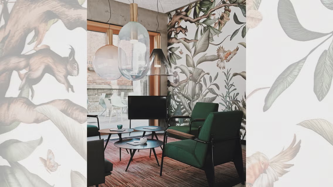
How to Think About Device-Specific Wallpaper Design
Desktop wallpapers and phone wallpapers behave differently in practice, and designing with that in mind leads to much better results. A desktop wallpaper typically sits behind a row of icons along the bottom or side of the screen, and sometimes a taskbar. The center of the canvas is the most visible area, so compositions with strong visual interest in the center work well. Busy designs in the lower portion of the canvas can compete with taskbar elements and make the overall screen look cluttered.
Phone wallpapers have two separate contexts: the home screen, which is covered in app icons arranged in a grid, and the lock screen, which is much more open. A design that works beautifully on a lock screen, with a centered subject or a clean gradient, may feel chaotic on a home screen where app icons are layered on top. Many designers create two slightly different versions for this reason: one with the main visual interest in the upper half for the home screen, and one centered or full-field for the lock screen.
If you are creating a wallpaper for a tablet, the aspect ratio typically lands somewhere between a standard desktop and a phone, with most iPads and Android tablets using a 4:3 or 16:10 ratio. Check your device specifically, since resizing a 16:9 desktop wallpaper to a 4:3 tablet canvas will crop the sides rather than the top and bottom, which can cut off parts of the composition you intended to keep.
When to Use AI Generation Versus Templates
Both approaches produce great results, but they suit different situations. Templates are best when you want something polished quickly and do not have a strong visual concept in mind yet. The browsing process itself often surfaces an idea you would not have thought of on your own. Templates are also predictable: what you see in the preview is close to what you get after editing.
AI generation is best when you have a specific visual concept you want to see realized but no image that matches it. Whether you want vibrant nature scenes, abstract art, or stylish patterns, the AI generation process creates high-quality wallpaper images for phones, desktops, or any device based on a text description. The tradeoff is that results are less predictable than templates, and the prompt quality matters: vague prompts produce generic images while specific, descriptive prompts produce genuinely distinctive results.
A useful hybrid approach is to generate an image first using a descriptive prompt, then treat it as the base layer for a template-style editing session where you add text, adjust colors, and layer design elements on top. This combines the originality of AI generation with the structured finishing that templates provide.
FAQs
What is the best wallpaper size for a desktop computer or laptop?
The right size depends on your specific screen’s resolution, which you can check in your computer’s display settings. For most modern HD monitors and laptops, 1920×1080 pixels at a 16:9 aspect ratio is the standard. For higher-resolution displays including 4K monitors and many modern Mac laptops with Retina screens, a resolution of 3840×2160 will produce a sharper result. If you use a resolution that is lower than your screen’s native resolution, the image will be upscaled by the operating system and may appear slightly soft or blurry. Most design platforms that offer wallpaper templates have a custom size field where you can enter your exact dimensions, and some include a Resize tool that reformats an existing design to new dimensions in a single click. If you are unsure what resolution to use, entering your laptop model into a search engine followed by “screen resolution” will return the manufacturer’s spec quickly.
Can I create a wallpaper using only my own photos, without any templates?
Yes, and many people prefer this approach because it results in something that feels completely personal. Most design platforms allow you to upload your own images as the starting canvas, then add design elements, text, or adjustments on top. If you are starting from a personal photo, the main consideration is resolution: a photo taken on a modern smartphone is typically high enough quality for a phone wallpaper, and often good enough for a desktop wallpaper at standard HD resolution. For very large screens or 4K displays, lower-resolution photos may appear soft. The most useful features when working from your own photo are background removal, image cropping, and color adjustment tools, which allow you to isolate a subject, reframe the composition, or adjust brightness and saturation without any technical photo editing knowledge. If your photo is well-composed but the colors feel off, a simple saturation or warmth adjustment often makes it feel complete without further editing.
Do I need to pay to download a wallpaper, or are free options genuinely usable?
Most major design platforms offer a free plan that allows you to create, edit, and download wallpapers without watermarks, using a subset of the available templates and design assets. The free tier is genuinely usable for most personal wallpaper projects: you have access to core editing tools, a meaningful portion of the template library, and the ability to upload and use your own images. What typically sits behind a paid plan includes access to the full premium template library, AI generation credits beyond a monthly free allotment, certain licensed fonts or graphics, and higher-resolution export options. For casual personal use, the free plan on most platforms covers everything you need. If you find yourself wanting access to a specific premium template or font, a short paid trial period is usually the most practical way to unlock it for a specific project rather than committing to an ongoing subscription.
How do I make my wallpaper look professional if I have no design experience?
The most reliable path to a professional-looking result without design training is to modify a professionally designed template rather than building from scratch. Templates are created by designers who have already solved the hard problems of layout, proportion, and color harmony. Your job is to personalize: replace placeholder imagery with your own photos, swap colors to a palette that feels right to you, and add or remove text. Beyond that, the two habits that most consistently improve wallpaper quality for non-designers are restraint and consistency. Restraint means adding fewer elements rather than more: a design with three elements used well will always look cleaner than one with eight elements competing for attention. Consistency means using the same font throughout, keeping colors within the same palette, and maintaining visual balance between the left and right sides of the canvas. Following these two principles on top of a good template base produces results that look intentional and polished without requiring any formal design knowledge.
Can I use the same wallpaper design across multiple devices, or do I need a separate version for each?
You can use the same design as a starting point across devices, but you will typically need at least two size versions: one for desktop or laptop (landscape orientation, 16:9 ratio) and one for phone (portrait orientation, 9:16 ratio). The visual content and color scheme carry over, but the composition may need adjustment since what looks centered and balanced on a wide horizontal canvas can feel cramped or awkwardly cropped when converted to a tall vertical one. Most platforms that offer a resize tool will reformat the canvas dimensions automatically, and you can then reposition elements to suit the new layout. For users who want true cross-device visual consistency, designing the main wallpaper first for the device you look at most, then using the resize tool to create adapted versions for other screens, is the most time-efficient approach. Some platforms allow you to duplicate a project before resizing, which means you can adjust the phone version without losing the original desktop composition. For help keeping track of which version is optimized for which device, a simple note-taking tool like Notion works well for logging your canvas dimensions and design decisions across projects.
Creating a custom wallpaper that actually looks the way you want it to look is faster and more achievable than most people expect. The combination of professionally designed templates, easy-to-use design asset libraries, and AI image generation has removed every major obstacle that used to make this feel like a task requiring specialized skills. Whether you start from a template and personalize it, generate an entirely original image from a text description, or build something from your own photos, the process from idea to finished wallpaper can take as little as ten minutes.
The tips in this guide are designed to help you skip the trial and error that makes design feel harder than it is. Start with the right canvas size, choose a template that matches the mood you want, make restrained and intentional edits, and use the resize tool to adapt your finished design for multiple screens. The result will feel personal, look polished, and stay exactly that way until you decide you are ready for something new.